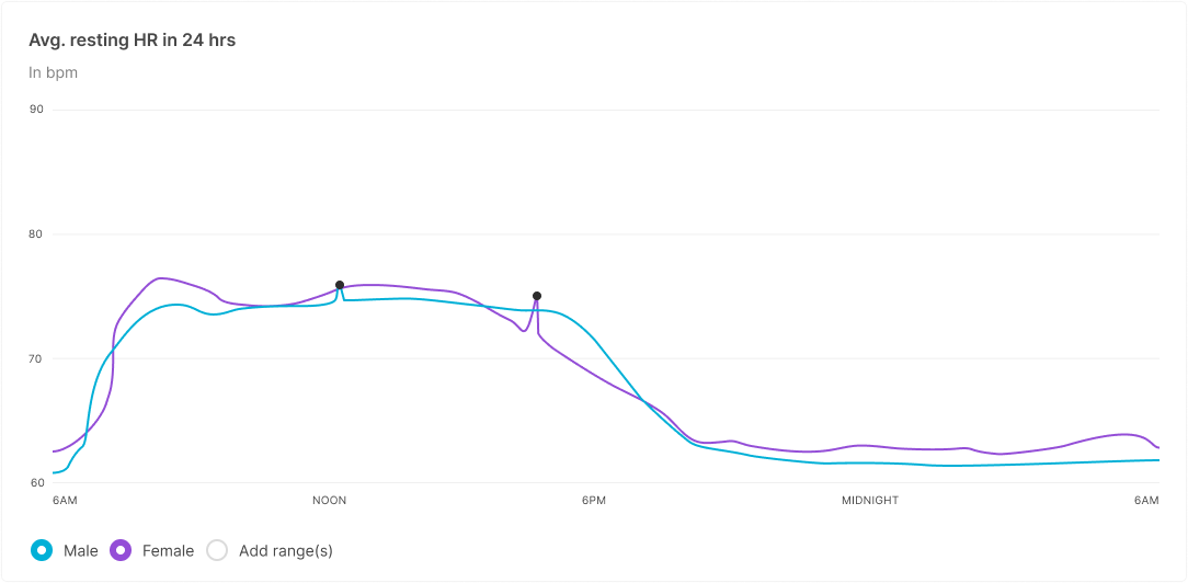
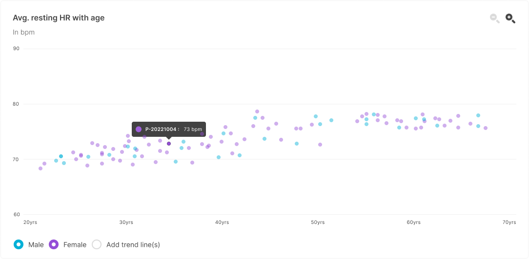
The web portal provides line graphs and scatter plot charts for easy visualization of the data collected through your study. Each one provides views of the general trends and of datapoints filtered by demographic.
To view graphs:
- From the Overview page, navigate to the Sensor Data section.
- Scroll to the desired graph or chart.
- Toggle the demographic categories on and off as desired.
- Toggle Average line(s) on to view the data trends.
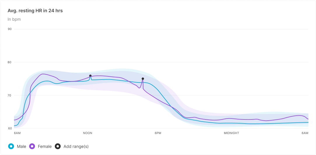
- Hover over datapoints of interest to reveal the associated participant.
-
Click a specific datapoint to view the associated participant records.
For more information about individual participant records, refer to Viewing Individual Results.